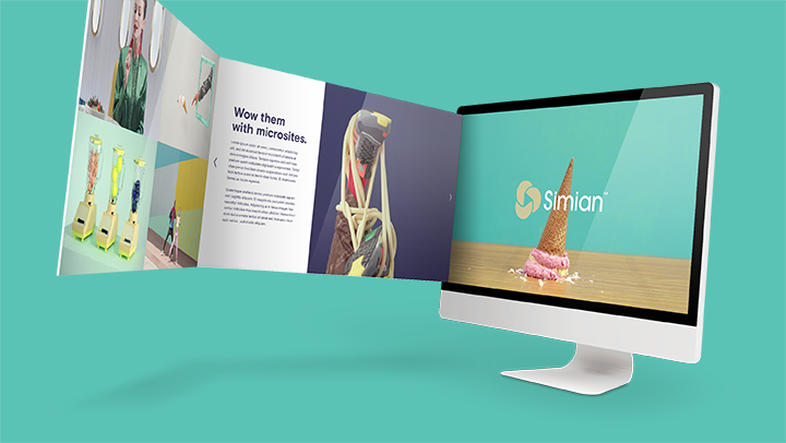
We’re excited to tell you about a significant upgrade to our microsite capabilities. This new feature allows users to create branded microsites with a distinct URL in minutes, utilizing a variety of template, layout and text placement options.
Part of our ongoing series of Simian 5 improvements, this new upgrade provides Simian users with a quick, efficient and friction-free way to create websites that can be used to present new work to clients or showcase your production or post production talent. It’s also a great, time-saving way to generate directors’ treatments or pitch decks, catalogue production elements or present any other visual content.

There are three design templates that can form the basis for your microsite. We’ve dubbed them FU-SION, CAT-A-LYST and RE-FRAC-TION, and each lends itself to a particular look and feel.
■ ‘FU-SION’ is a modern, video, image and reel centric template with multiple page layouts and design options. It works well for company pages or pages dedicated to specific projects, spots or campaigns.
■ ‘RE-FRAC-TION’ is a parallax-style, scrolling layout that displays images, video and text in full browser width. It works well for presenting work, video and text in a modern, continuously flowing style.
■ ‘CAT-A-LYST’ is a versatile, easy-to-use slide-show generator which lends itself to creating directors’ treatments, pitch decks or other presentations that can highlight your creative ideas and visions.
But wait, there’s more! You can now upload video backgrounds for these layouts, and populate your media choices by inserting showreels from your Reel Library. Multiple gallery layouts, too, with various mouseover styles for thumbnails. We’ve enhanced the font management selection process, and updated the WYSIWYG editor for easy content management. And on top of all this, we’ve boosted the responsiveness of the microsites, so they’ll play beautifully across all platforms and devices.
Simian users tap microsites for everything from pitches to pre-pro books, location scouting, review & approval, projects, partner presentations, you name it – some even use them for their main company web sites. What’s great about this feature is that it gives them instant access to everything within their Reel or Media Libraries, and makes building really attractive sites a breeze.
“These layout options are designed for people who need to get something produced quickly and efficiently and don’t have a lot of time in which to do it,” explains Simian’s Chief Technology Officer Jay Brooks. “They let you do a lot, without a whole lot of effort.”
To learn more about our new Microsites, or to view video tutorials on how they work, check out our Knowledge Base articles.
MORE FROM THE SIMIAN BLOG

Staying Connected and Proactive Helped Reps Stay the Course
Plenty has been said in industry forums about how production and post have weathered the challenges of the past year ...

Reel Insights 2020 WFH Edition
Ever wondered whether you had too many spots on your reel? Or if it was too long? How about when would be the best ti...

Our Redesigned Projects App Lets you Work Smarter
Your ‘Little Friend’ – aka the new Simian Projects App – can really be a big help these days when production ...

Post House Owners & MDs Look Forward with Optimism
Anyone who's tuned in to an AICP Town Hall or one of its Post Council meetups knows that life in the post-pandemi...

Better Together: HoPs Eager to Get Back
Have we had enough of remote work yet? Yes, indeed. That seemed to be the pervasive sentiment as Simian held its most...


